
Design
A more grown-up Embiro, without losing its character
The decisions behind our website refresh: keep the teal, yellow and bold identity, then make the experience calmer, clearer and easier to use.
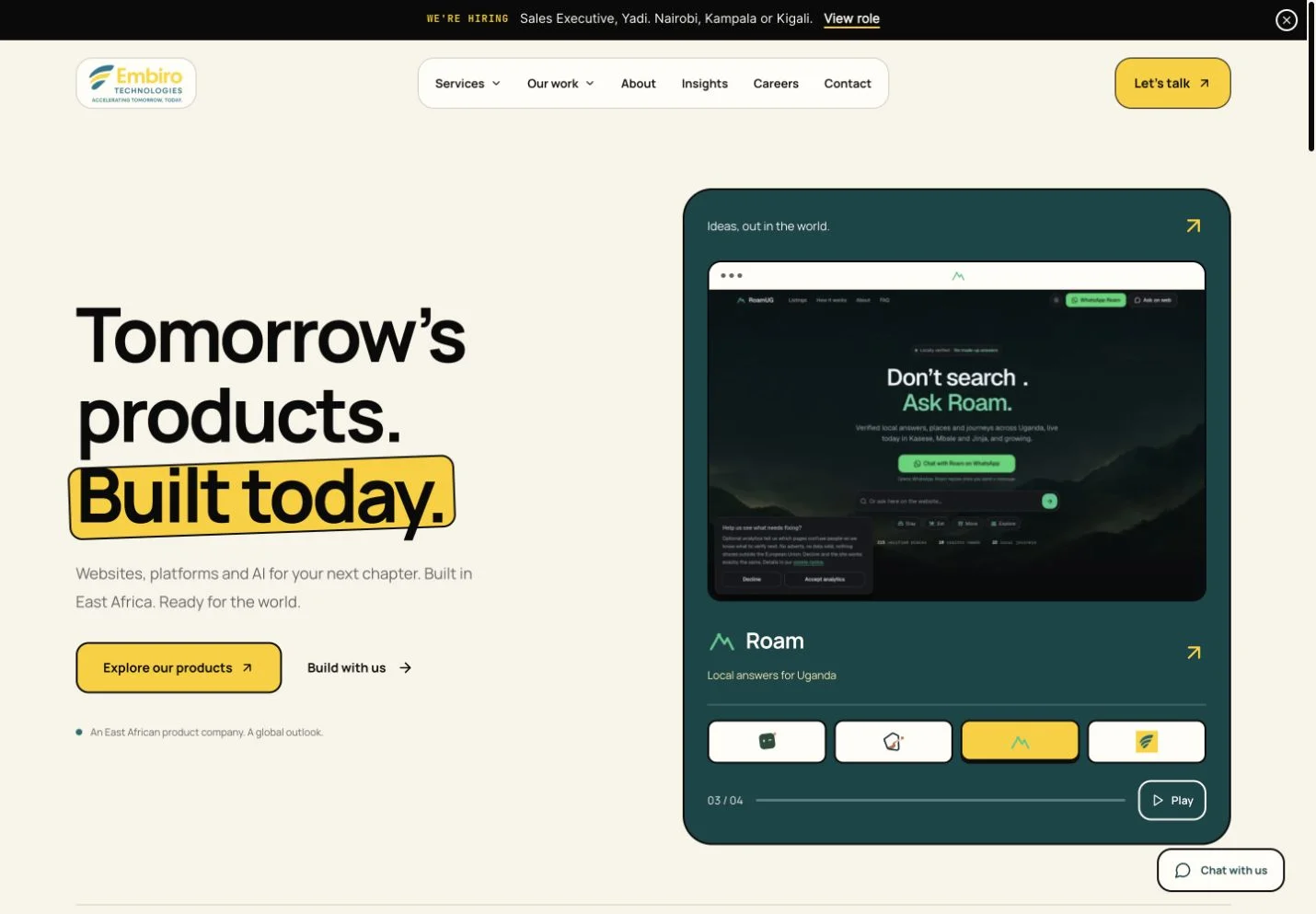
Keep the recognisable parts
The brief for our own website was a balancing act: make Embiro feel more established and professional without losing the character of the brand. The logo, teal and yellow were staying. So was the bold, tactile quality of the design.
Yellow remains an accent with a purpose, rather than the background to every message.
That gave us a useful constraint. We could not treat “more enterprise” as an instruction to replace everything with a neutral template. The task was to make the existing identity work better for businesses and institutions considering a serious project.
We kept strong borders and distinctive colour, introduced a more rounded treatment, and used Manrope to bring the typography together. Cream and paper surfaces give the brighter elements room to do their job. Yellow remains an accent with a purpose, rather than the background to every message.
The details have to agree
The navigation became a good test of the direction. We explored separate containers for the logo, navigation items and call to action. Once those elements stood apart, differences in height, alignment and corner radius became much more noticeable.
We brought those dimensions into agreement. On scroll, a contained shared background can bring the navigation together again, while the inner elements lose the extra boundaries that would make the header feel like a collection of boxes inside a box.
That process is a reminder that a design system is experienced through relationships. A button can look right on its own and still feel wrong beside the navigation. Consistent measurements help the overall composition feel intentional.
Let the work carry more of the story
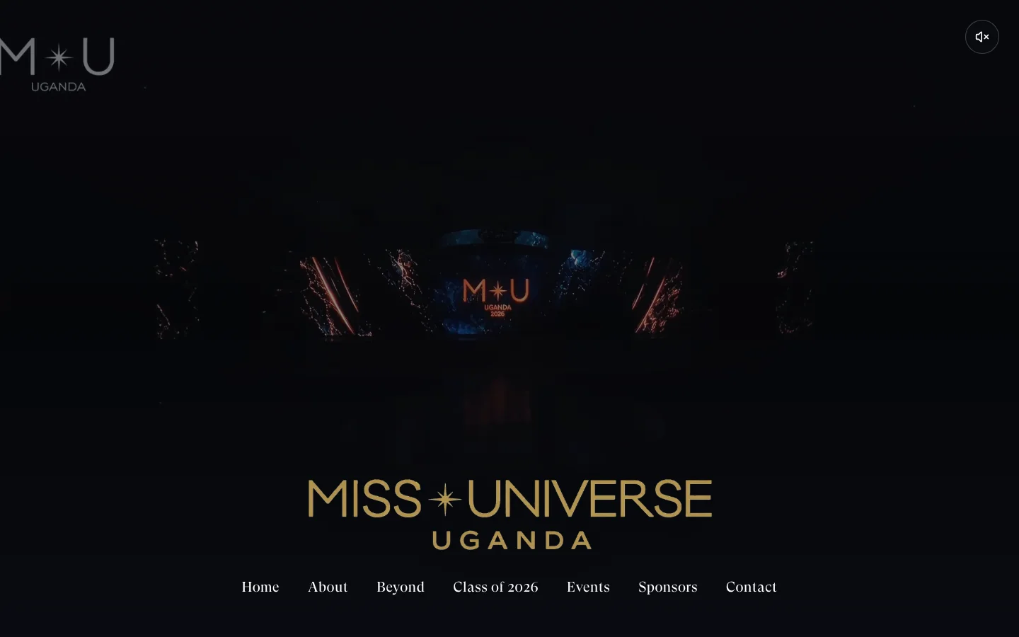
The homepage now introduces Embiro through products and selected work as well as services. Real homepage screenshots and product identities give visitors something concrete to look at while they decide whether our work is relevant to them.
We also brought case studies into the experience. A screenshot shows an outcome, but the accompanying story explains the starting point and the choices behind it. Together, they are more useful than a wall of claims about quality or innovation.
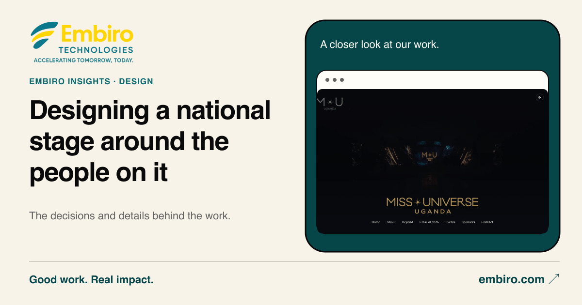
The same thinking shaped the new share images. When someone shares a project, the preview can carry that project’s own screenshot inside a consistent Embiro frame. The identity stays recognisable while the work remains the subject.
Give motion a job, too
We added page transitions, scroll entrances and timed sequences for sections with several features or steps. These should help a visitor follow the story rather than compete with it. Pause controls and reduced-motion behaviour belong in the same discussion as the animation itself.
Mobile made the trade-offs clear. A header or cookie banner that feels compact on a desktop can cover too much of a phone. We refined those surfaces to leave more room for the page while keeping navigation and consent choices usable.
The result is an evolution of the brand. It keeps the recognisable ingredients and asks more of each one: the typography must establish a hierarchy, the colour must guide attention, the motion must support understanding and the work must give people a reason to trust the introduction.