
Design
Designing a national stage around the people on it
For Miss Universe Uganda, we built the website’s story around delegates, advocacy and the national journey. Here is what that meant for the experience.
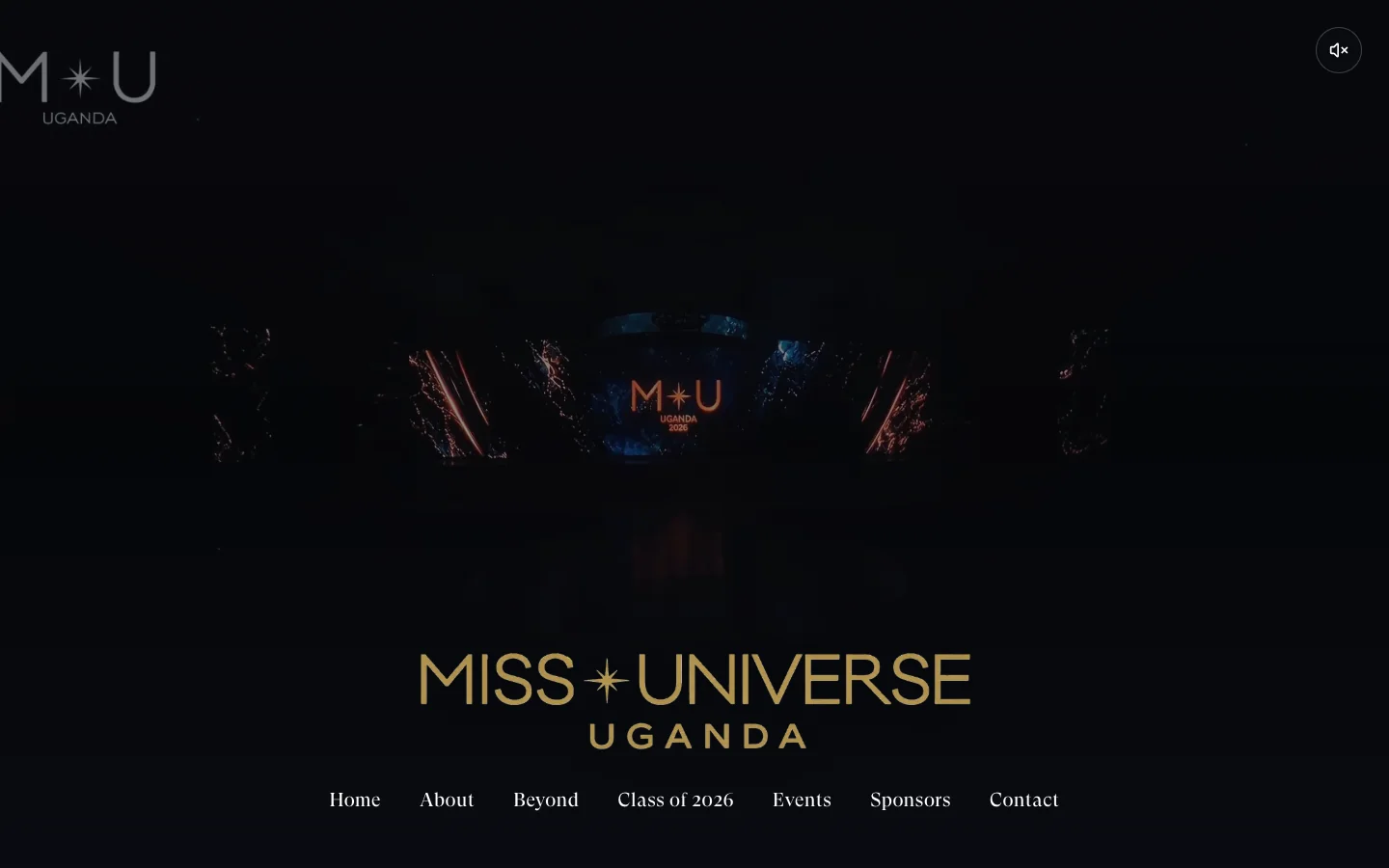
More than a place to announce a winner
A pageant website has a strong visual subject. That can make it tempting to lead with spectacle and leave the useful information to follow. The brief for Miss Universe Uganda asked for something broader: an official digital home for the delegates, their advocacy and the national journey.
The site needed to help visitors find their way into that story. Some arrive to explore the people involved. Others are looking for the season, event information or ways to participate. A single dramatic image cannot carry all of those jobs.
Our design direction was to put the women at the centre, then organise the season, partners and participation around them. That gave the visual identity a purpose: introduce the people and make the journey understandable.
The order of information tells a story
Hierarchy is one of the most consequential decisions in a website. What appears first tells a visitor what the organisation values. What comes next determines whether the initial impression turns into understanding.
For this project, profiles and stories help give the pageant a human centre. Event information and routes into participation make it useful beyond a first visit. The result is an experience that brings the public-facing parts of the pageant into one recognisable place.
This does not mean every visitor must follow one carefully prescribed sequence. A useful site gives people several clear ways in. Someone already looking for an event should not have to read the entire brand story before finding it.
People
Introduce the delegates and the advocacy that gives their participation context.
The journey
Give the season, stories and event information a recognisable home.
Participation
Make it clear where visitors can explore further or get involved.
Give strong imagery a useful structure
Editorial images are central to the experience. They establish the atmosphere and let the people carry the visual story. Their value depends on the content around them: a name, a useful heading, a route to learn more or a clear next action.
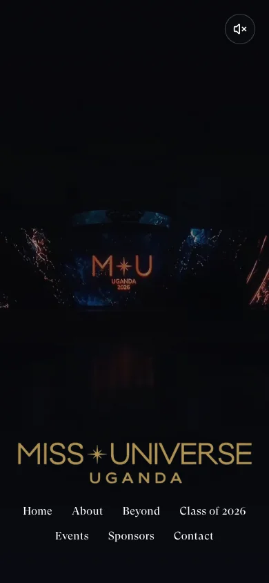
The mobile view is part of the design, not an afterthought to the desktop composition.
We wanted the identity to hold together across the site without every page feeling like the same poster. Consistent typography and navigation provide continuity. The content gives each part of the experience its own reason to exist.
On a phone, those relationships become especially important. An image that looks generous on a desktop must still leave room for context and navigation on a small screen. The mobile view is part of the design, not an afterthought to the desktop composition.
Build a home for an ongoing story
An event has a date. An organisation has a continuing story. Designing only for a launch announcement can leave a site feeling finished the moment that announcement is no longer new.
The public experience for Miss Universe Uganda connects profiles, stories and event information within the same identity. That structure gives visitors more than a moment to look at; it gives them a place to explore.
The lesson applies beyond pageants. Conferences, cultural organisations and membership communities all benefit when the website makes the people and the purpose visible, then gives the surrounding information a clear role.